This is just a quick post to pass the time between the instalments of my ongoing series on Media Center development. The objective of this article is to show you how to build a simple progress bar control using MCML. I wrote this article in response to the statistic than several people landed on my site after searching for “progress bar mcml” on Google (thank you, Google Analytics!). Hopefully future visits will not go unrewarded this time 🙂

Progress bar control

Concept

The progress bar is mostly comprised of static content; A bottom-most <ColorFill> element is mostly obscured and forms a border around the control. Within a slightly smaller area, two other <ColorFill> elements are overlayed onto eachother; one fills the available space and represents the background, while the other represents the fill and scales according to the percentage of the progress it is displaying. Finally, the top-most element is <Text> which expresses the progress as a written percentage.

Implementation

Code

The VectorTransformer class is used by the progress bar:

/// <summary>
/// Transformer for converting one or more fractional values into a Vector3 representation.
/// </summary>
public class VectorTransformer : ITransformer {

    /// <summary>
    /// Format string that dictates which dimension of the vector is
    /// represented by the value, e.g. "{0},1,1". The remaining dimensions
    /// are taken from the format string itself.
    /// </summary>
    public string Format { get; set; }

    /// <summary>
    /// Transforms the input value into a Vector3 representation.
    /// </summary>
    /// <param name="value">Input value.</param>
    /// <returns>Output value.</returns>
    public object Transform(object value) {
        string[] parts = String.Format(Format, value).Split(',');
        return new Vector3(
            Single.Parse(parts[0]),
            Single.Parse(parts[1]),
            Single.Parse(parts[2])
        );
    }
}

Markup

ProgressBar.mcml

Usage

<UI Name="ProgressBarTest">
  <Locals>
    <cor:Single Name="ProgressPercent" Single="0.16" />
  </Locals>
  <Rules>
    <Binding Source="[ProgressPercent]" Target="[ProgressBar.Value]" />
  </Rules>
  <Content>
    <me:ProgressBar Name="ProgressBar" Size="500,60" />
  </Content>
</UI>

Obviously, a practical example would bind the Value property of the progress bar to a changing variable rather than a constant value as used in this example. The Size property is optional and simply sets the size of the control.

Explanation

The only aspect of the content model that really needs to be explained is the <ColorFill> element used to represent the “fill” portion of the bar. We manipulate its Scale property in order to make it represent the progress. Unless otherwise specified, the origin used for scaling (and indeed transforming in any other way) an element in MCML is the vector (0,0,0).

At this point, i’ll note that you use Transformers in MCML whenever you need to convert, transform or format a value as part of a <Set> or <Binding> rule. There are several built-in transformers such as MathTransformer and FormatTransformer. The VectorTransformer class allows us to transform a single scalar fraction (i.e. the progress “value”) into a Vector3 (used by the Media Center SDK) which is constant in two dimensions and variable in the other. Due to the default origin, all we need to do is manipulate the X-axis scale to get the element to behave as desired. We use a FormatTransformer later on to format the fraction into a percentage (without any decimal places) using the standard .NET format string “P0”.

Final Words

Visually, this progress bar control is quite simplistic, but it does not look out of place within the Media Center UI. A more visually complex control might use the standard button background graphic (which, if you recall, uses nine-grid scaling to avoid looking skewed or jagged) and its “pressed” animation graphic, applied in the same manner as the Windows Vista/7-style progress bar, which pulses periodically while idle. Nevertheless, my implementation does the job at hand and provides both an indicator of progress and something to look at during a lengthy asynchronous operation. In my next article, I will deliver more information on my network browsing/copying add-in for Media Center, as originally promised.

In the last post, I introduced a command button for use in Media Center add-ons. In doing so, I demonstrated the idea of input focus, Command objects and rules to dictate behaviour and data-binding. All of these concepts are transferrable to this instalment’s topic:

A List Control (with Selected Item Tracking)

A simple way of visualising a data source, for the purpose of performing some action on one of its items, is to display the items as a series of buttons. The advantage of using buttons is that they already provide a mechanism for selection (i.e. mouse/keyboard focus) and action (i.e. clicking and invoking a command). With this in mind, the basic goals for a list control are:

  • Dynamically create a button for each item in the list (using the list item to provide text for the button) – for this, we will use a <Repeater> element
  • Arrange the buttons using some logical layout – i’ll introduce the <GridLayout> for this
  • Keep track of which list item is selected – in this regard, it is useful to know both the item and its index in the list. These require a holding mechanism which we will define in code.
  • Regardless of which item is selected, invoke only a single command in response to an action on the list – this will utilise <InvokeCommand>.

Definition

Code

public class ListSelection : ModelItem {

    private int _index;
    private object _item;

    public int Index {
        get {
            return _index;
        }
        set {
            _index = value;
            FirePropertyChanged("Index");
        }
    }

    public object Item {
        get {
            return _item;
        }
        set {
            _item = value;
            FirePropertyChanged("Item");
        }
    }
}

Markup

List.mcml

Usage

<UI Name="ListTest">
  <Locals>
    <ArrayListDataSet Name="[Items]">
      <Source>
        <cor:String String="First item" />
        <cor:String String="Second item" />
        ...
      </Source>
    </ArrayListDataSet>
    <Command Name="ListItemCommand" />
  </Locals>
  <Content>
    <me:List Name="List" Model="[Items]" Command="[ListItemCommand]" />
  </Content>
</UI>

In the above example, the data source is declared inline in MCML markup; normally, the source would be external, perhaps passed to the UI as a property. The ArrayListDataSet class is simply a collection that implements the Media Center SDK interface IPropertyObject, which provides change detection. It is often desirable to bind an IList or IList<T> first to an ArrayListDataSet and then to a UI element, so that changes to the collection are reflected automatically in the UI.

The command declared in the <Locals> section above is not being used for anything; it is merely provided to demonstrate how to associate a command with the list control.

In the <Rules> section of the UI, we could bind to List.SelectedIndex or List.SelectedItem in order to determine which list item was selected. In practice, these properties would be examined when handling the invocation of the list’s command.

Explanation

ListSelection class

In order to track the item which is selected in the list, we need to pass an object to the list item which it can update when it receives focus (it’s not like WinForms where we can just handle an event on the child from within the parent). This item has to be passed by reference, not by value, otherwise changes will not be reflected – so we can’t just use cor:Int32. Additionally, we want to support change notifications – this way, we can use the selection in binding expressions – the best way to achieve this under the Media Center SDK is to extend the ModelItem class and call its FirePropertyChanged() method whenever the item or index are set.

Note that you can simply implement the IPropertyObject interface if you do not want to extend from ModelItem, however only the latter provides a cross-thread compatible mechanism for raising change notifications. Since my network browsing add-on will use worker threads (and raise events on these), this is essential.

List – Properties

The list needs a data source of some sort which implements System.Collections.IList – the data-binding mechanisms in the Media Center SDK do not seem to play nicely with generics (with that said, List<T> implements IList anyway, so that is an acceptable data source).

Since we will be essentially aggregating the Command objects from the list items, we need to require a single command to represent an action performed on the list.

Although ListSelection is being used internally to track the selected item/index, we will expose SelectedIndex and SelectedItem as primitive-type properties for convenience.

List – Content

This example introduces the <Repeater> element, which is the UI primitive used to emit particular UI content for each item in a data source. It will re-emit its content whenever the data source or its content changes.

Like any other container, the repeater can specify a layout for its content. So far i’ve demonstrated Anchor, Dock and VerticalFlow layouts. To make the most of the available space on the screen, particularly when the number of items is unknown (and dynamic), a flow layout can be wasteful. The <GridLayout> will automatically arrange its content into a grid of uniformly-sized cells, filling downward (or sideward) before wrapping to the next column (or row).

The actual list items are defined in a separate <UI> tag – i’ll explain these later. What is important is that we pass several pieces of data to the list items when defining the repeated content: Two reserved object paths, [RepeatedItem] and [RepeatedItemIndex] (which are only valid inside repeater elements), are assigned to each list item so that they have an awareness of a) the item that led to their creation and b) its index in the data source. We must also pass the local instance of ListSelection for the aforementioned reasons.

For the command that must be specified for each list item, we are using an <InvokeCommand>. This is a specialised version of Command which invokes a method, and allows this method to be specified inline. The description comes from the item in the data source (in this case, we just call the ToString() method), and the target of the invocation is the command associated with the whole list. (This performs the aggregation I mentioned.)

List Item – Properties

We cannot simply use the Button element to represent a list item, as we need to extend it to perform selection tracking. This is done via the BaseUI attribute. We need only override the properties and rules – the content and base behaviour are already defined. As stated above, the list item requires the data source item that created it, its index in the data source and the selection holder from the owning list.

List Item – Rules

When the button receives key focus (recalling that key focus can be caused by the keyboard, mouse or remote control), we need to update the owning list’s selection holder so that the selected item and index match the item and index for the list item. This is achieved using a simple <Condition> rule with <Set> actions. The owning list will see changes to these properties (through change notification) and update its properties accordingly.

Next Time

In the next article, i’d like to take a break from MCML and introduce my network browsing and copying add-on. I’ll demonstrate how the add-on is structured, the separation of logic between the download manager service and the interactive portion, and how it achieves the principal tasks of browsing the network, retrieving the paths to media libraries and, finally, copying files.

Continuing the series of articles on Media Center development, this post introduces a command button with the standard Media Center look-and-feel:

A Command Button

Button element

Last time, we looked at a UI element for a page title. That was a good example of a non-interactive element. To get any real functionality in an add-on, we will need interactive elements; the most rudimentary of which is a simple command button.

This implementation was derived by reverse-engineering the built-in command button defined in Microsoft.MediaCenter.Shell.dll – that implementation relies on managed objects which cannot be accessed from third party code. My version removes those dependencies (and some lesser-used functionality) and updates the MCML-2006 (Vista) markup to MCML-2008 (Windows 7). While the markup for the built-in button cannot be used, the image and sound resources from ehres.dll can and are employed to provide a consistent look-and-feel.

Attributes of a Command Button

  • Must be able to receive focus – we do this by setting Input.KeyInteractive and examining Input.KeyFocus.
  • Must perform an action – we need to associate a <Command> with the button, and trigger the command when the button is clicked.
  • Must have a text label – we can use the Description property on the command to provide this; conceptually, this is the preferred method (see the Explanation section for the reasoning).
  • Can be disabled – the properties on the command also support this.

The Windows 7 Media Center look-and-feel dictates that command buttons:

  • Have an empty background normally and a glass-style background when focused
  • Change (brighten) the colour of their text when focused
  • Play sounds when focused and when clicked (which vary according to the action performed)
  • Display a steadily pulsing animation when focused
  • Display an animated highlight when clicked

Buttons in Media Center, therefore, have a layout which divides content into the following, overlapping layers:
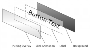
Content for Button element

Definition

Button.mcml

Usage

<me:Button>
  <Model>
    <Command Description="Button Text" />
  </Model>
</me:Button>

…or:

<me:Button Model="[SomeCommand]" />

It is considered best practice if you declare the <Command> object in the <Locals> or <Properties> section of your UI, rather than inline.

Explanation

Commands

In the Media Center SDK, commands are objects on the View-Model which implement the ICommand interface or extend from the Command class. They can be declared either in MCML markup or in code (in the latter case, they must then be passed to the view). They represent actions that can be performed in the add-on, in a manner which does not dictate how they are represented at the view layer. Similarly, they do not actually dictate what occurs when they are invoked; it is left for that behaviour to be defined separately, either in the <Rules> section of the markup or in code. This disconnected representation allows you to change either the behaviour or the appearance of the command without affecting the other.

Below is an example of how a command might typically be implemented, showing its declaration, behaviour and attachment to a button:

<UI Name="ButtonUsage">
  <Locals>
    <Command Name="MyCommand" Description="Perform Action" />
  </Locals>
  <Rules>
    <Changed Source="[MyCommand.Invoked]">
      <Actions>
        <Invoke Target="[SomeClass.SomeMethod]" />
      </Actions>
    </Changed>
  </Rules>
  <Content>
    <me:Button Model="[MyCommand]" />
  </Content>
</UI>

Resources

In most places where an object path or inline constructor can be used in MCML, a resource URL can be used as an alternative. Most of the image/sound resources used by the standard Media Center look-and-feel are located in ehres.dll, a non-managed resource DLL. For such a DLL, resources are accessed using a URL as follows:

res://DllName!ResourceName.extension

You can also reference your own resources from within managed assemblies. The syntax is:

resx://AssemblyName/DefaultNamespace.Properties.Resources/ResourceName

The command button uses a number of images and sounds from Media Center and declares them as properties – you could override them when placing the button element in your own markup.

Nine-Grid Rendering

All of the images used for the button which are resizable make use of a special concept called Nine-Grid Rendering, whereby the original image is divided into 9 sections; when resizing, the 4 corner sections remain at their original size. The 4 outer sides scale in only one direction and the center section is the only region which scales in both directions. This technique is particularly useful for resizing images with some sort of border; in this case, the glass-style button graphic. Without this technique, the rounded borders would appear oversized, skewed and/or fuzzy. When declaring an <Image> object, the NineGrid attribute allows you to specify that Nine-Grid rendering is to be used when scaling, and where the left, top, right and bottom divider lines will be placed.

ClickHandler

By instantiating ClickHandler in the markup for a UI element, you provide a mechanism for handling click events (mouse click, remote OK/Select key, keyboard enter key). You can examine the value of Clicking to determine whether the key/button is in the process of being clicked. (There are also more specific handlers such as KeyHandler which you can use for text entry, etc.)

Content

The button introduces a number of new visual elements and layout types, as well as animation.

Please note that I will not be covering animation in this article – it is well documented in the SDK and not the focus of this section.

With respect to the layout shown in the diagram (near the top of this article), the various “layers” of the button are implemented as follows:

  • Label and Background – As overlapping children inside a <Panel> element using the Anchor layout (the panel scales down to fit its content), docked to fill the available space within the root panel, factoring in margins for the label. The background introduces the <Graphic> element, which displays an image file as well as having the capacity to host visual elements of its own. Although larger and situated behind the label, the background graphic scales with the text.
  • Click Animation – Uses the <Clip> element introduced in the previous article to make the animated highlight graphic fade seamlessly into the edges of the region. Uses the Fill layout to occupy all available space within the button. When shown or hidden, the highlight graphic plays a sweeping animation (Show and Hide type animations).
  • Focus Overlay – This is designed to be a mostly-transparent image that sits at the top of the z-order and pulses slowly (an Idle type animation), again filling all of the available space.

Rules

The button element also introduces rules, which allow its visual and behavioural states to change in reaction to input (i.e. focus and clicking). The rules for the button simply do as indicated at the start of this article, however I shall introduce each of the rule types:

<Default> – Used to set a default value to apply to an object/element in the absence of any other rules. Particularly useful for assigning values to attributes of the UI element itself, such as Input. Used in this case to specify that the button element can receive key focus. (In Media Center, “key” focus means keyboard, remote control and mouse unless otherwise configured.)

<Binding> – Used to create a one-way binding, usually between a property or model item and a visual element. Used by the button implementation to enforce the enabled/disabled behaviour, show/hide the click animation, set the button size and ensure the text on the button always matches the command description.

<Rule> – Used to handle and react to focus and click events as outlined in the behavioural description of the button earlier in this article. A rule has conditions and actions:

  • Typically, the <Equality> condition is used to react when objects have a specific value, whereas the <Modified> condition is used to react whenever a object’s value changes. Additionally, the modified condition can be used to handle events on objects in code (e.g. Command.Invoked).
  • You can use actions to change object values (<Set>), invoke methods in code (<Invoke>) or play sounds/animations.

I should also point out some equivalence with rule elements; you will see both <Rule> elements (which tend to represent more complex behaviours) and shorthand forms:

Shorthand Version Equivalent To
<Condition Source="[Source]"
           SourceValue="[Value]"
           Target="[Target]"
           Value="[Value]"
/>
<Rule>
  <Conditions>
    <Equality Source="[Source]" Value="[Value"] />
  </Conditions>
  <Actions>
    <Set Target="[Target]" Value="[Value]" />
  </Actions>
</Rule>
<Condition Source="[Source]" SourceValue="[Value]">
  <Actions>
    ...
  </Actions>
</Condition>
<Rule>
  <Conditions>
    <Equality Source="[Source]" Value="[Value"] />
 </Conditions>
 <Actions>
   ...
 </Actions>
</Rule>
<Changed Source="[Source]">
  <Actions>
    ...
  </Actions>
</Changed>
<Rule>
  <Conditions>
    <Modified Source="[Source]" />
  </Conditions>
  <Actions>
    ...
  </Actions>
</Rule>

The most important rule to note is the one which invokes the command associated with the button; when the Invoked event on the ClickHandler is fired (“modified” in MCML), the Invoke method is called on the Command object. Combined with the other visual and behavioural rules, we have everything we need to start using command buttons.

Next Time

In the next instalment, I want to demonstrate the <Repeater> and <Scroller> elements to show how to display a scrollable list of items from a data source, and then demonstrate how to track the selected item. In my network browsing add-on, this mechanism will be used to navigate through computers, shares and folders, and to select files.

Last time, I gave a broad overview of the Windows Media Center SDK and introduced my (then-nameless) first add-on, mceNetworkCopy. This instalment (and the next few) of my series on developing for Media Center covers the controls and visual elements needed for the add-on. Where possible, i’m trying to match the standard look-and-feel of Media Center. I’ll introduce new concepts as I go.

A Title Element

Title element in the Windows 7 Media Center style

Each distinct area within Media Center has its own title, which is displayed in the top-right corner of the screen. To give the impression of seamless integration, my network browing add-on should display its title in a manner consistent with the standard.

Definition

The following is the MCML markup for a generic “title” element which matches the (Windows 7) Media Center style:

<Mcml xmlns="http://schemas.microsoft.com/2008/mcml"
      xmlns:me="Me"
      xmlns:cor="assembly://MsCorLib/System"
>
<UI Name="Title">
  <Properties>
    <cor:String Name="Content" String="$Required" />
    <Font Name="Font" FontName="Segoe Media Center Light" FontSize="46" />
  </Properties>
  <Content>
    <Panel Layout="Dock" Padding="0,32,48,0">
      <Children>
        <Clip Layout="Anchor" Alpha="0.85" FadeSize="90" Orientation="Vertical" ShowNear="false">
          <LayoutInput>
            <DockLayoutInput Position="Top" Alignment="Far" />
          </LayoutInput>
          <Children>
            <Text Content="[Content]" Color="DeepSkyBlue" Font="[Font]" />
          </Children>
        </Clip>
      </Children>
    </Panel>
  </Content>
</UI>
</Mcml>

Usage

The element is placed in a top-level container and referenced as follows:

<me:Title Content="my add-on" />

The namespace prefix “me” was declared earlier, and must be used for any elements defined in the same MCML file. Because Content is marked as a required property, it must be specified as an attribute when including the element. I could also have specified a Font attribute to override the default that I specified in the <properties> section. Any of the properties common to <UI> could also be included; for example, I may wish to vary the opacity of the title element using the Alpha attribute.

Explanation

All controls, visual elements and pages begin with the <UI> tag, indicating the inheritance of the type that the SDK will generate. A UI may contain the following child elements:

  • <Locals>
    These are akin to private members in a class. You can instantiate classes from the add-on assembly, the Media Center assemblies or the wider .NET Framework (using appropriate XML namespace prefixes).
  • <Properties>
    These are akin to public members in a class, and become attributes/child-elements when the UI is referenced in other parts of the markup. They can be referenced using object paths (which are used in data binding and other types of rules). You can force the value of a property to be specified by using the reserved phrase “$Required” – this is also a way of ensuring that the object isn’t instantiated locally.
  • <Rules>
    This section specifies default values, data bindings, event handlers (“changed” rules) and specifies how the UI should change in response to various conditions.
  • <Content>
    This is where the visual content of the UI is specified. You should only place one child element here – if more are required, place them inside an appropriate container (Panel, Clip, ColorFill, Scroller, etc).

We start by declaring two properties; one required, one defined internally, but overridable if desired. For the text included on the element, we use cor:String (referencing System.String). The convention used for the built-in UI elements is to name it “Content”.

This element is designed to be placed inside a top-level container, meaning that it can place itself anywhere on the screen. So, relative to the whole screen, we place a Panel with an aesthetically-pleasing amount of padding within it. Panels support a number of different layouts; some of which shrink to fit their content, others which fill the available space in the parent container. In this case, our outermost panel must take the size of its parent (i.e. the whole screen). Since we would like the place the text in the top-right corner, the Dock layout is appropriate.

The <LayoutInput> tag is included with each item inside a container whose layout is Dock, Anchor or Form. It specifies how the child element should be arranged within the container. In this case, we specify a <DockLayoutInput> representing top-right placement.

The Clip element is used to restrict rendering to a specific boundary. In this case, we want to exploit its ability to gradually fade its content out as it appropriates that boundary (because titles in Media Center exhibit this behaviour). By applying the Anchor layout, we define the boundary as being whatever space is needed by the content. The Orientation, FadeSize and ShowNear attributes all control the fade effect.

Finally, the text that forms the title is specified using the <Text> element. The square-bracket notation used in assigning values to the attributes indicates that we are using object paths instead of literal values. In this case, we are assigning values from the properties we defined earlier. As a required property, “Content” will be specified later, when the title element is actually used.

Next Time

In the next article, i’ll introduce a command button which matches the look-and-feel of those used in Media Center.

A few weeks ago, I finally got around to realising a long-held ambition; I built a media center PC. Hardware has come a long way since the last time I tried to have a PC permanently hooked-up to my TV; Composite TV-out has been replaced by HDMI-out. Analogue TV tuners with pass-through audio have been replaced by digital TV tuners that can dump raw digital video straight into a recorder. Processors are now capable of encoding 720p video while simultaneously playing back other media. And how could I fail to mention Windows Media Center itself, to bring everything together on the big screen? In short, this is a really exciting time to own a media center. It’s also rather an exciting time to look into developing add-ons for Media Center.

Over the next few weeks, i’ll be learning the ins and outs of the Media Center SDK, version 6.0 (for Windows 7), and hopefully producing a few add-ons in the process. Don’t get me wrong, Windows Media Center is a great front-end, but the functionality offered is very focused and targeted. There is an enormous scope for add-on functionality, both to address genuine needs/shortcomings and to provide a richer, more entertaining experience.

Some objectives I have for my media center PC over the long term include:

  • Pulling down new media from other networked PCs
  • Simplifying the process of tagging and organising the media library
  • Playing streaming radio stations (a feature seemingly unavailable to Australian users)
  • Displaying song lyrics while music is playing
  • Accessing twitter/RSS feeds

The Media Center SDK

First up, the SDK provided by Microsoft for Media Center is .NET-based. If you really wanted to, you could develop a hybrid native/managed assembly using C++/CLI, but it really lends itself to C#. The SDK heavily enforces the MVVM architectural pattern – to the point where it is actually impossible to instantiate Media Center UI objects from code. This creates a heavily sandboxed environment, but there are no restrictions on functionality; only on presentation. All visual elements of a Media Center add-on must be written in the XML-based Media Center Markup Language (MCML). MCML can be thought of as a distant cousin of WPF; the markup consists of visual elements, animations, properties/variables, data bindings and rules to create interactivity. The principal difference is that MCML defines only a small handful of visual primitives and has no built-in controls – everything must be constructed and tailored to the application’s needs.

So, a typical add-on written using the Media Center SDK consists of:

  • A .NET assembly (class library) containing the application (and data access) logic. The assembly must be installed in the GAC. The minimum requirement is that a class in the assembly implements the IAddInModule and IAddInEntryPoint interfaces. The Launch() method must navigate to the first MCML page.
  • MCML markup representing the page(s) that make up the user interface of the add-on. Since all files are referenced using absolute URIs, it’s reccommended that markup be included inside the add-on assembly as a resource. (Resources can be accessed using special URIs, e.g. resx://Assembly/Assembly.Properties.Resources/Resource)
  • A registration file (XML-based), which can be passed to RegisterMCEApp.exe (included with Media Center). This specifies how the add-on is launched from within Media Center.

Note: It’s also possible to write background applications which have no UI and web applications which are entirely markup-based and make use of remote resources.

What you can do with the SDK:

  • Add new areas/screens to Media Center
  • Use the Media Center environment as the presenter for your application
  • Play and control media already supported by Media Center
  • Navigate around the existing Media Center UI
  • Control and interact with Live/Recorded TV functionality
  • Control and interact with CD/DVD burning functionality
  • (Indirectly) access the user’s media libraries (the user can supply your add-on with items from the library)

What you cannot do with the SDK:

  • Change existing areas/screens within the Media Center UI
  • Directly access/control the viewport or audio/video streams
  • Add support for formats which Media Center cannot ordinarily play
  • Directly access the user’s media libraries (search/browse)

Add-ons which achieve any of the above behaviour typically do so by displaying their own window on top of the Media Center UI.

Development Tools

In addition to Visual Studio, you will typically use the following (included with the SDK):

  • XML Schema Definitions (XSD files) for the MCML format – adding these to Visual Studio makes authoring MCML files significantly easier.
  • Media Center Preview Tool – can be configured to run after compilation in Visual Studio. The tool previews markup and most basic functionality.
  • Windows Media Center – you can set debugging options within Media Center itself. You will need to use the real Media Center app in order to see your markup against a background, and whenever you reference types in the SDK relating to the Media Center environment or add-in host.

Additionally, I find Resource Hacker to be very useful in identifying built-in resources (images, sounds, markup) that can be used in add-ons in order to create the impression of seamless integration.

Initial Experiments

For my first foray into the world of Media Center development, I am writing an add-on for browsing the network and copying files to the media PC. Although it is possible to add shared locations to the media library, it is often desirable to copy content to the local machine instead – and while this can be done from the remote PC, it’s useful to control and monitor the process from the destination.

The back-end code for the add-on is fairly trivial; I will be using some Win32 API calls in order to enumerate networked computers and shares, but browsing within a share requires only the standard methods on the Path, File and Directory classes in System.IO. Additionally, I will be using the WebClient class in System.Net to actually copy the files, as it supports asynchronous downloading with progress indication.

The real challenge lies in the learning curve associated with MCML. My goal is to match the standard look-and-feel of Media Center as best as possible, however, without any built-in controls I will have to learn how to build appropriate UI elements using the techniques available. In particular, my add-on will need buttons, list items, a busy indicator and a progress bar.

At the time of writing, I have a functioning prototype of the add-on; however, I wish to detail and document its development further before sharing the implementation here.

Next Time…

Stay tuned for the next instalment of the series, where I will be looking at building the controls and visual elements required for my Media Center add-on, with a focus on matching the standard look-and-feel.