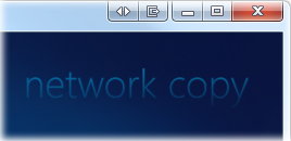
Last time, I gave a broad overview of the Windows Media Center SDK and introduced my (then-nameless) first add-on, mceNetworkCopy. This instalment (and the next few) of my series on developing for Media Center covers the controls and visual elements needed for the add-on. Where possible, i’m trying to match the standard look-and-feel of Media Center. I’ll introduce new concepts as I go.
A Title Element

Each distinct area within Media Center has its own title, which is displayed in the top-right corner of the screen. To give the impression of seamless integration, my network browing add-on should display its title in a manner consistent with the standard.
Definition
The following is the MCML markup for a generic “title” element which matches the (Windows 7) Media Center style:
<Mcml xmlns="http://schemas.microsoft.com/2008/mcml"
      xmlns:me="Me"
      xmlns:cor="assembly://MsCorLib/System"
>
<UI Name="Title">
  <Properties>
    <cor:String Name="Content" String="$Required" />
    <Font Name="Font" FontName="Segoe Media Center Light" FontSize="46" />
  </Properties>
  <Content>
    <Panel Layout="Dock" Padding="0,32,48,0">
      <Children>
        <Clip Layout="Anchor" Alpha="0.85" FadeSize="90" Orientation="Vertical" ShowNear="false">
          <LayoutInput>
            <DockLayoutInput Position="Top" Alignment="Far" />
          </LayoutInput>
          <Children>
            <Text Content="[Content]" Color="DeepSkyBlue" Font="[Font]" />
          </Children>
        </Clip>
      </Children>
    </Panel>
  </Content>
</UI>
</Mcml>
Usage
The element is placed in a top-level container and referenced as follows:
<me:Title Content="my add-on" />
The namespace prefix “me” was declared earlier, and must be used for any elements defined in the same MCML file. Because Content is marked as a required property, it must be specified as an attribute when including the element. I could also have specified a Font attribute to override the default that I specified in the <properties> section. Any of the properties common to <UI> could also be included; for example, I may wish to vary the opacity of the title element using the Alpha attribute.
Explanation
All controls, visual elements and pages begin with the <UI> tag, indicating the inheritance of the type that the SDK will generate. A UI may contain the following child elements:
- <Locals>
These are akin to private members in a class. You can instantiate classes from the add-on assembly, the Media Center assemblies or the wider .NET Framework (using appropriate XML namespace prefixes). - <Properties>
These are akin to public members in a class, and become attributes/child-elements when the UI is referenced in other parts of the markup. They can be referenced using object paths (which are used in data binding and other types of rules). You can force the value of a property to be specified by using the reserved phrase “$Required” – this is also a way of ensuring that the object isn’t instantiated locally. - <Rules>
This section specifies default values, data bindings, event handlers (“changed” rules) and specifies how the UI should change in response to various conditions. - <Content>
This is where the visual content of the UI is specified. You should only place one child element here – if more are required, place them inside an appropriate container (Panel, Clip, ColorFill, Scroller, etc).
We start by declaring two properties; one required, one defined internally, but overridable if desired. For the text included on the element, we use cor:String (referencing System.String). The convention used for the built-in UI elements is to name it “Content”.
This element is designed to be placed inside a top-level container, meaning that it can place itself anywhere on the screen. So, relative to the whole screen, we place a Panel with an aesthetically-pleasing amount of padding within it. Panels support a number of different layouts; some of which shrink to fit their content, others which fill the available space in the parent container. In this case, our outermost panel must take the size of its parent (i.e. the whole screen). Since we would like the place the text in the top-right corner, the Dock layout is appropriate.
The <LayoutInput> tag is included with each item inside a container whose layout is Dock, Anchor or Form. It specifies how the child element should be arranged within the container. In this case, we specify a <DockLayoutInput> representing top-right placement.
The Clip element is used to restrict rendering to a specific boundary. In this case, we want to exploit its ability to gradually fade its content out as it appropriates that boundary (because titles in Media Center exhibit this behaviour). By applying the Anchor layout, we define the boundary as being whatever space is needed by the content. The Orientation, FadeSize and ShowNear attributes all control the fade effect.
Finally, the text that forms the title is specified using the <Text> element. The square-bracket notation used in assigning values to the attributes indicates that we are using object paths instead of literal values. In this case, we are assigning values from the properties we defined earlier. As a required property, “Content” will be specified later, when the title element is actually used.
Next Time
In the next article, i’ll introduce a command button which matches the look-and-feel of those used in Media Center.

Pingback: Developing with the Media Center SDK, Part 3 | Brad Smith's Coding Blog